Reimagined
Dejaten
A website designed to pre-qualify interest before the first conversation.
Year :
2025
Industry :
Wedding
Client :
DejaTen
Project Duration :
3 weeks


Situation
I’m not embarrassed to say that one of my first commercial projects was for my mum.
DejaTen is a business she’s been running for over two decades, and like most family businesses, I grew up around it – helping at exhibitions, packing samples, answering questions, and absorbing the unglamorous realities that sit behind a creative brand. I built her first website when I was 18. It did the job, but the business outgrew it.
As DejaTen matured, the volume of enquiries grew too – especially from couples who asked questions, requested pricing, browsed examples, then disappeared. Not because the offering wasn’t right, but because the reassurance they needed wasn’t happening in one place.
This new website wasn’t about chasing more leads.
It was about doing the heavy lifting for the conversations that didn’t convert.


Challenge
Minimalist wedding websites are deceptively hard.
Done well, they feel calm, confident, and premium.
Done poorly, they feel empty, generic, or unfinished.
The challenge here was twofold. First, the site needed to communicate experience without noise – decades of work, hundreds of weddings, and a clear process – all without slipping into cliché wedding language. Second, the visuals had to feel considered without turning into a never-ending photoshoot.
DejaTen’s body of work is huge. Photographing everything properly would’ve meant the site launching sometime around 2050. So the strategy had to be selective: show enough to establish taste and range, without pretending this was the full archive.
Subtlety mattered. Especially in motion. Minimalist layouts only work when spacing, rhythm, and animation are doing their jobs quietly in the background.




Solution
The website was designed as a filter.
Every section answers the questions people usually ask before they ever get in touch – what style do you do, how experienced are you, what’s the process, what does it roughly cost, and is this right for my wedding?
The homepage sets the tone immediately. Neutral colour palettes, restrained typography, and deliberate pacing make it clear that this is a calm, confident service – not a trend-chasing studio. The work is allowed to breathe. Nothing competes for attention.
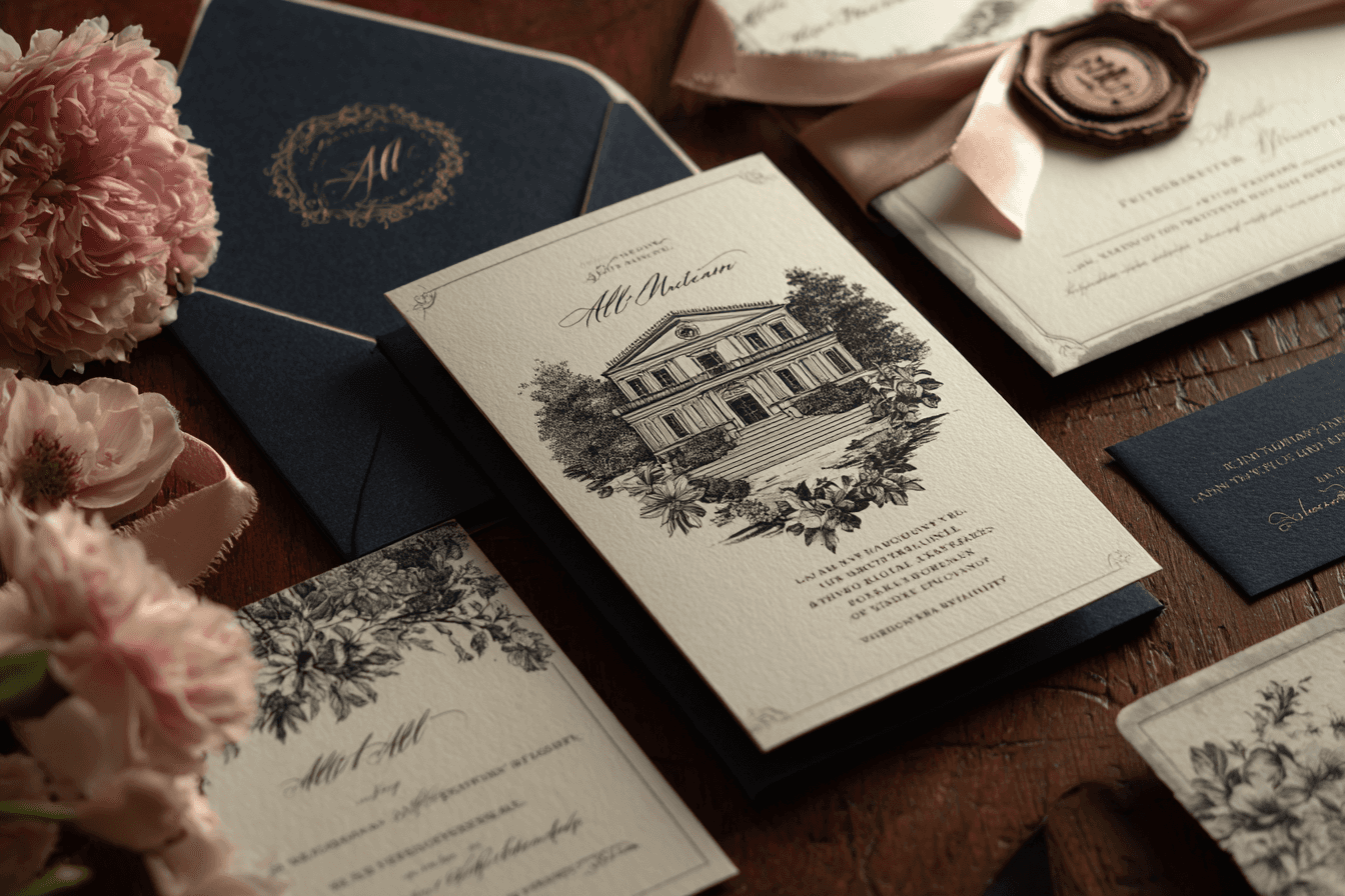
For imagery, I took a hybrid approach. I used a Sony A7 to capture high-quality examples in controlled conditions, then used AI tools like PhotoRoom to refine and uplift those images. These weren’t meant to represent the entire catalogue – they’re exemplars. Enough to establish taste, print quality, and attention to detail.
The “Works” section leans into that idea. It’s a curated selection, not an exhaustive archive. The intent is reassurance, not overwhelm. If couples like what they see here, they’ll trust the rest of the process.
The About and Process sections do quiet credibility work. Metrics like weddings supported, years of experience, and satisfaction rates are surfaced without turning the site into a sales page. It’s factual, not boastful.
The contact page is where the strategy really shows. Between clear contact details, a considered enquiry form, and a well-structured FAQ, the site pre-answers most objections. By the time someone reaches out, they’re already warmer, clearer, and more likely to convert.
Subtle animation ties everything together. Small movements, gentle transitions, and hover states add just enough polish to make the experience feel intentional, without ever drawing attention to themselves.
Outcome
The new DejaTen website now acts as a silent salesperson.
It handles the questions that don’t convert.
It filters out poor-fit enquiries.
And it builds confidence before a single conversation happens.
Couples arrive informed, reassured, and aligned with the style and process. The site doesn’t push them – it lets them decide, which is exactly how this category works.
For me personally, it was a full-circle project. A chance to revisit one of my earliest clients with better taste, better tools, and a clearer understanding of how digital experiences influence real-world decisions.
Minimalist, done properly, isn’t empty.
It’s precise.


More Projects
Reimagined
Dejaten
A website designed to pre-qualify interest before the first conversation.
Year :
2025
Industry :
Wedding
Client :
DejaTen
Project Duration :
3 weeks


Situation
I’m not embarrassed to say that one of my first commercial projects was for my mum.
DejaTen is a business she’s been running for over two decades, and like most family businesses, I grew up around it – helping at exhibitions, packing samples, answering questions, and absorbing the unglamorous realities that sit behind a creative brand. I built her first website when I was 18. It did the job, but the business outgrew it.
As DejaTen matured, the volume of enquiries grew too – especially from couples who asked questions, requested pricing, browsed examples, then disappeared. Not because the offering wasn’t right, but because the reassurance they needed wasn’t happening in one place.
This new website wasn’t about chasing more leads.
It was about doing the heavy lifting for the conversations that didn’t convert.


Challenge
Minimalist wedding websites are deceptively hard.
Done well, they feel calm, confident, and premium.
Done poorly, they feel empty, generic, or unfinished.
The challenge here was twofold. First, the site needed to communicate experience without noise – decades of work, hundreds of weddings, and a clear process – all without slipping into cliché wedding language. Second, the visuals had to feel considered without turning into a never-ending photoshoot.
DejaTen’s body of work is huge. Photographing everything properly would’ve meant the site launching sometime around 2050. So the strategy had to be selective: show enough to establish taste and range, without pretending this was the full archive.
Subtlety mattered. Especially in motion. Minimalist layouts only work when spacing, rhythm, and animation are doing their jobs quietly in the background.


Solution
The website was designed as a filter.
Every section answers the questions people usually ask before they ever get in touch – what style do you do, how experienced are you, what’s the process, what does it roughly cost, and is this right for my wedding?
The homepage sets the tone immediately. Neutral colour palettes, restrained typography, and deliberate pacing make it clear that this is a calm, confident service – not a trend-chasing studio. The work is allowed to breathe. Nothing competes for attention.
For imagery, I took a hybrid approach. I used a Sony A7 to capture high-quality examples in controlled conditions, then used AI tools like PhotoRoom to refine and uplift those images. These weren’t meant to represent the entire catalogue – they’re exemplars. Enough to establish taste, print quality, and attention to detail.
The “Works” section leans into that idea. It’s a curated selection, not an exhaustive archive. The intent is reassurance, not overwhelm. If couples like what they see here, they’ll trust the rest of the process.
The About and Process sections do quiet credibility work. Metrics like weddings supported, years of experience, and satisfaction rates are surfaced without turning the site into a sales page. It’s factual, not boastful.
The contact page is where the strategy really shows. Between clear contact details, a considered enquiry form, and a well-structured FAQ, the site pre-answers most objections. By the time someone reaches out, they’re already warmer, clearer, and more likely to convert.
Subtle animation ties everything together. Small movements, gentle transitions, and hover states add just enough polish to make the experience feel intentional, without ever drawing attention to themselves.
Outcome
The new DejaTen website now acts as a silent salesperson.
It handles the questions that don’t convert.
It filters out poor-fit enquiries.
And it builds confidence before a single conversation happens.
Couples arrive informed, reassured, and aligned with the style and process. The site doesn’t push them – it lets them decide, which is exactly how this category works.
For me personally, it was a full-circle project. A chance to revisit one of my earliest clients with better taste, better tools, and a clearer understanding of how digital experiences influence real-world decisions.
Minimalist, done properly, isn’t empty.
It’s precise.


More Projects
Reimagined
Dejaten
A website designed to pre-qualify interest before the first conversation.
Year :
2025
Industry :
Wedding
Client :
DejaTen
Project Duration :
3 weeks


Situation
I’m not embarrassed to say that one of my first commercial projects was for my mum.
DejaTen is a business she’s been running for over two decades, and like most family businesses, I grew up around it – helping at exhibitions, packing samples, answering questions, and absorbing the unglamorous realities that sit behind a creative brand. I built her first website when I was 18. It did the job, but the business outgrew it.
As DejaTen matured, the volume of enquiries grew too – especially from couples who asked questions, requested pricing, browsed examples, then disappeared. Not because the offering wasn’t right, but because the reassurance they needed wasn’t happening in one place.
This new website wasn’t about chasing more leads.
It was about doing the heavy lifting for the conversations that didn’t convert.


Challenge
Minimalist wedding websites are deceptively hard.
Done well, they feel calm, confident, and premium.
Done poorly, they feel empty, generic, or unfinished.
The challenge here was twofold. First, the site needed to communicate experience without noise – decades of work, hundreds of weddings, and a clear process – all without slipping into cliché wedding language. Second, the visuals had to feel considered without turning into a never-ending photoshoot.
DejaTen’s body of work is huge. Photographing everything properly would’ve meant the site launching sometime around 2050. So the strategy had to be selective: show enough to establish taste and range, without pretending this was the full archive.
Subtlety mattered. Especially in motion. Minimalist layouts only work when spacing, rhythm, and animation are doing their jobs quietly in the background.


Solution
The website was designed as a filter.
Every section answers the questions people usually ask before they ever get in touch – what style do you do, how experienced are you, what’s the process, what does it roughly cost, and is this right for my wedding?
The homepage sets the tone immediately. Neutral colour palettes, restrained typography, and deliberate pacing make it clear that this is a calm, confident service – not a trend-chasing studio. The work is allowed to breathe. Nothing competes for attention.
For imagery, I took a hybrid approach. I used a Sony A7 to capture high-quality examples in controlled conditions, then used AI tools like PhotoRoom to refine and uplift those images. These weren’t meant to represent the entire catalogue – they’re exemplars. Enough to establish taste, print quality, and attention to detail.
The “Works” section leans into that idea. It’s a curated selection, not an exhaustive archive. The intent is reassurance, not overwhelm. If couples like what they see here, they’ll trust the rest of the process.
The About and Process sections do quiet credibility work. Metrics like weddings supported, years of experience, and satisfaction rates are surfaced without turning the site into a sales page. It’s factual, not boastful.
The contact page is where the strategy really shows. Between clear contact details, a considered enquiry form, and a well-structured FAQ, the site pre-answers most objections. By the time someone reaches out, they’re already warmer, clearer, and more likely to convert.
Subtle animation ties everything together. Small movements, gentle transitions, and hover states add just enough polish to make the experience feel intentional, without ever drawing attention to themselves.
Outcome
The new DejaTen website now acts as a silent salesperson.
It handles the questions that don’t convert.
It filters out poor-fit enquiries.
And it builds confidence before a single conversation happens.
Couples arrive informed, reassured, and aligned with the style and process. The site doesn’t push them – it lets them decide, which is exactly how this category works.
For me personally, it was a full-circle project. A chance to revisit one of my earliest clients with better taste, better tools, and a clearer understanding of how digital experiences influence real-world decisions.
Minimalist, done properly, isn’t empty.
It’s precise.


