Fresh build
Zaarr Fashions
A structured website designed to answer buyer questions in the order they naturally arise.
Year :
2026
Industry :
Fashion
Client :
Zaarr Fashions
Project Duration :
4 weeks
Situation
Zaarr wasn’t trying to become a “fashion brand” online - they were trying to be taken seriously as a manufacturing partner in new markets like Australia. That’s a different job.
Buyers in that space don’t just look at the product. They look for signals: does this feel like a real operation, does it feel established, does it look like you belong next to the labels you’re trying to sell into?
Zaarr had the craft and capability, but digitally it was a blank page. No brand system, no website, and no professional catalogue. Just iPhone photos of samples - great for showing details, not great for building trust at first glance.
So the goal wasn’t “make a nice website”. The goal was: build legitimacy fast, without faking it.

Challenge
Fashion has an annoying rule: the bar is high even when the budget isn’t.
To look credible in this category you normally need studio shoots, models, styling, lighting, post-production - the whole production line. Zaarr didn’t have that runway-ready budget yet, and waiting wasn’t an option because the market doesn’t pause while you save up.
There was also a second problem hiding underneath the first - consistency.
Even if the garments are stunning, if the visuals feel mixed (different lighting, different angles, different quality), the whole thing reads as “early stage”. Buyers don’t always say that out loud - they just bounce.
So this became a design problem with a business constraint: how do you create the feeling of an established label without spending like one?
Solution
I treated the website like a guided tour - not a brochure.
The structure does a lot of heavy lifting. You can see it in the way the pages behave like “gateway pages” - Home, About, Collection, Contact - each one answering a different buyer question in the order they naturally show up. (What is this? Can they do it? Do I like the product? Who’s behind it? How do I reach them?)
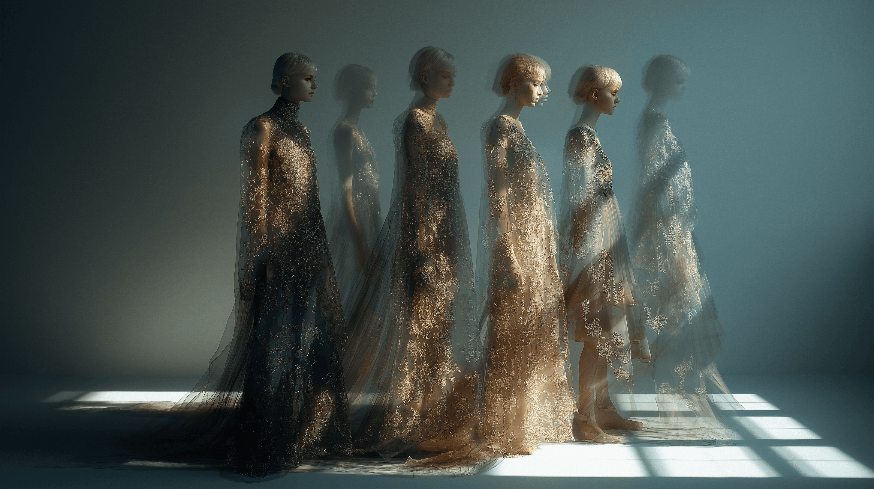
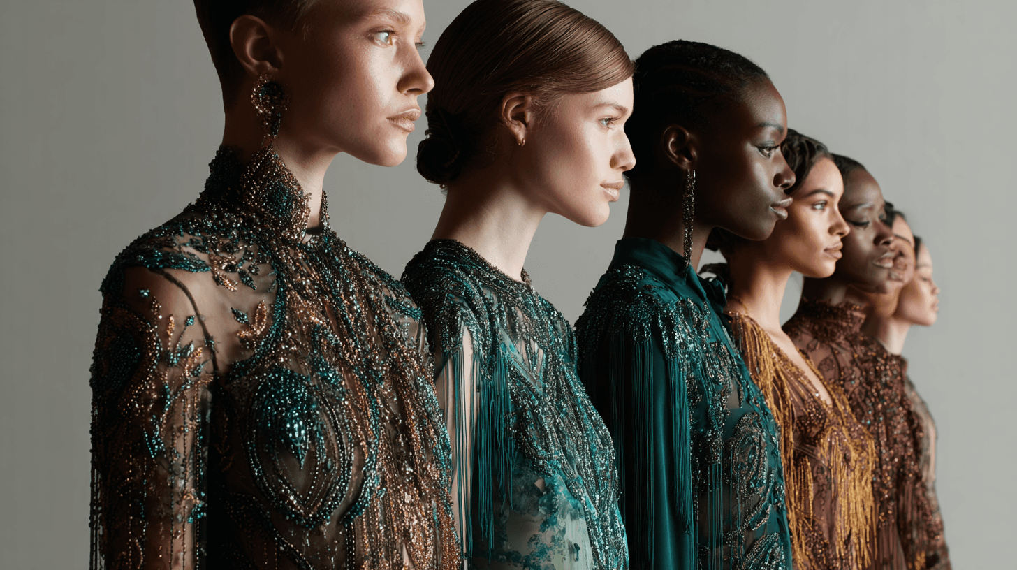
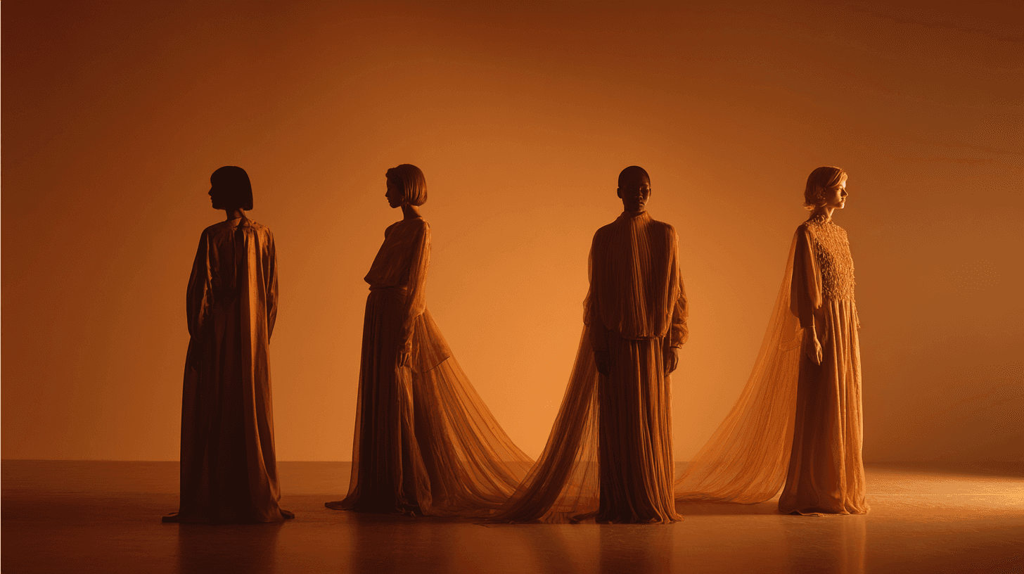
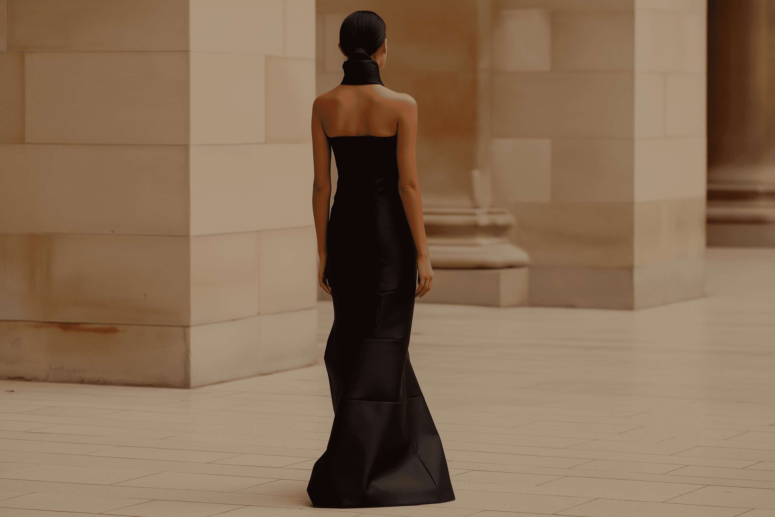
Visual strategy - consistency beats perfection
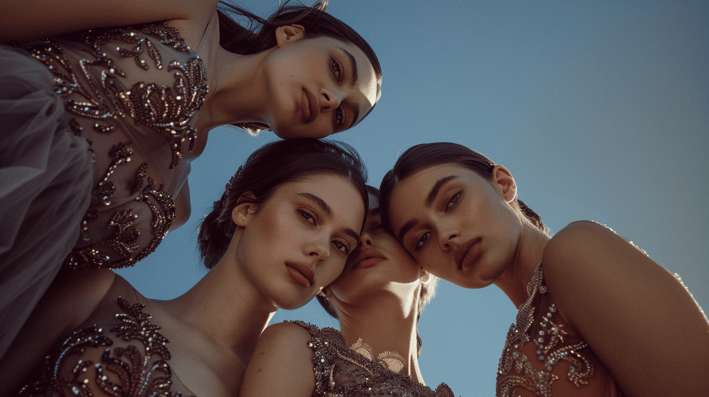
Instead of trying to chase one perfect hero image, I built a system that could scale. Using AI workflows, I took the best of what the iPhone photos had (real garment detail, real embellishment, real construction cues) and translated that into a consistent catalogue style.
The trick wasn’t making it look “AI cool”. The trick was making it look boringly consistent - same visual logic across pieces, so nothing distracts, nothing feels random, and the collection reads as intentional.
That’s why the collection presentation works. It’s not screaming for attention. It’s calm. It’s controlled. It looks like a label that already knows who buys it.
Collection design - reduce scroll chaos
The collection page isn’t just a grid of dresses - it’s organised like a buyer’s shortlisting brain. Filters like special occasion, partywear, cocktail dresses, wedding occasion make it instantly usable. This is the kind of small UX decision that turns “nice visuals” into “this is actually helpful”.
It also subtly signals scale. If you have categories, you have range. If you have range, you’re not a one-off.
Capability and proof - show the factory, then show the receipts
The About page is where you stop relying on aesthetics and start stacking proof.
You bring in manufacturing imagery (the floor, the environment, the reality), then you anchor it with stats and performance markers - the kind business owners and designers actually look for when they’re deciding whether to trust you with production.
This is also where social proof is used properly - not as empty logo wallpaper, but as reassurance. The flow you’ve built is basically:
You can do it → you’ve done it → you do it consistently.
Even your proof language leans “operations”, not “marketing”. Things like repeat relationships and defect targets are the kinds of signals that make buyers feel safe.
Social proof layout - make it scannable
The way you organised clients and credibility is deliberately frictionless. The “Clients” section is clean and structured - it reads as a quick roll-call of legitimacy, not a brag wall. It’s easy to scan, easy to trust, and it doesn’t hijack the page.
Then you do something smart: you move from brands to people.
Team - add faces right when trust matters
Once the visitor’s thinking “ok, this looks real”, the next question is “who am I dealing with?”
Dropping Rohit and Sarika into the flow gives the site an actual human endpoint. It shifts the story from “a company” to “a team”, which is exactly what you want before the contact page.
Contact - make conversion feel premium, not desperate
The contact experience is intentionally overbuilt (in the best way). You’ve got a full-page hero moment, a clean “Get in touch” details block, and a form version that feels like a modern overlay - not a boring template contact form.
It’s also consistent with the rest of the site - the same restrained typography, the same calm pacing, the same “quiet confidence” vibe. Even the CTA placement feels considered - it’s present, but it’s not begging.
And the imagery choice here matters: it keeps the site feeling editorial and premium, even though the original constraint was “we don’t have the budget for this”. You basically used tools to buy time until the business can justify full production shoots later.
Outcome
Zaarr went from “we exist, trust us” to a digital presence that can hold its own next to the labels it wants to sell into.
They now have:
a collection experience that’s usable for buyers (filters, categories, consistent presentation)
credibility signals that answer the operational questions (capability, proof points, performance markers)
social proof that feels clean and intentional (clients organised as reassurance, not noise)
a clear conversion path that feels premium (contact experience that matches the category)
The biggest win is that the site doesn’t feel like a workaround. It feels like a brand that already belongs in the room - and that’s exactly what it needed to do.
Most of the imagery was created or enhanced using tools like Midjourney and Kling, but the “magic” isn’t the toolset - it’s the discipline: consistency, structure, and sequencing.
More Projects


Fresh build
Zaarr Fashions
A structured website designed to answer buyer questions in the order they naturally arise.
Year :
2026
Industry :
Fashion
Client :
Zaarr Fashions
Project Duration :
4 weeks
Situation
Zaarr wasn’t trying to become a “fashion brand” online - they were trying to be taken seriously as a manufacturing partner in new markets like Australia. That’s a different job.
Buyers in that space don’t just look at the product. They look for signals: does this feel like a real operation, does it feel established, does it look like you belong next to the labels you’re trying to sell into?
Zaarr had the craft and capability, but digitally it was a blank page. No brand system, no website, and no professional catalogue. Just iPhone photos of samples - great for showing details, not great for building trust at first glance.
So the goal wasn’t “make a nice website”. The goal was: build legitimacy fast, without faking it.
Challenge
Fashion has an annoying rule: the bar is high even when the budget isn’t.
To look credible in this category you normally need studio shoots, models, styling, lighting, post-production - the whole production line. Zaarr didn’t have that runway-ready budget yet, and waiting wasn’t an option because the market doesn’t pause while you save up.
There was also a second problem hiding underneath the first - consistency.
Even if the garments are stunning, if the visuals feel mixed (different lighting, different angles, different quality), the whole thing reads as “early stage”. Buyers don’t always say that out loud - they just bounce.
So this became a design problem with a business constraint: how do you create the feeling of an established label without spending like one?
Solution
I treated the website like a guided tour - not a brochure.
The structure does a lot of heavy lifting. You can see it in the way the pages behave like “gateway pages” - Home, About, Collection, Contact - each one answering a different buyer question in the order they naturally show up. (What is this? Can they do it? Do I like the product? Who’s behind it? How do I reach them?)
Visual strategy - consistency beats perfection
Instead of trying to chase one perfect hero image, I built a system that could scale. Using AI workflows, I took the best of what the iPhone photos had (real garment detail, real embellishment, real construction cues) and translated that into a consistent catalogue style.
The trick wasn’t making it look “AI cool”. The trick was making it look boringly consistent - same visual logic across pieces, so nothing distracts, nothing feels random, and the collection reads as intentional.
That’s why the collection presentation works. It’s not screaming for attention. It’s calm. It’s controlled. It looks like a label that already knows who buys it.
Collection design - reduce scroll chaos
The collection page isn’t just a grid of dresses - it’s organised like a buyer’s shortlisting brain. Filters like special occasion, partywear, cocktail dresses, wedding occasion make it instantly usable. This is the kind of small UX decision that turns “nice visuals” into “this is actually helpful”.
It also subtly signals scale. If you have categories, you have range. If you have range, you’re not a one-off.
Capability and proof - show the factory, then show the receipts
The About page is where you stop relying on aesthetics and start stacking proof.
You bring in manufacturing imagery (the floor, the environment, the reality), then you anchor it with stats and performance markers - the kind business owners and designers actually look for when they’re deciding whether to trust you with production.
This is also where social proof is used properly - not as empty logo wallpaper, but as reassurance. The flow you’ve built is basically:
You can do it → you’ve done it → you do it consistently.
Even your proof language leans “operations”, not “marketing”. Things like repeat relationships and defect targets are the kinds of signals that make buyers feel safe.
Social proof layout - make it scannable
The way you organised clients and credibility is deliberately frictionless. The “Clients” section is clean and structured - it reads as a quick roll-call of legitimacy, not a brag wall. It’s easy to scan, easy to trust, and it doesn’t hijack the page.
Then you do something smart: you move from brands to people.
Team - add faces right when trust matters
Once the visitor’s thinking “ok, this looks real”, the next question is “who am I dealing with?”
Dropping Rohit and Sarika into the flow gives the site an actual human endpoint. It shifts the story from “a company” to “a team”, which is exactly what you want before the contact page.
Contact - make conversion feel premium, not desperate
The contact experience is intentionally overbuilt (in the best way). You’ve got a full-page hero moment, a clean “Get in touch” details block, and a form version that feels like a modern overlay - not a boring template contact form.
It’s also consistent with the rest of the site - the same restrained typography, the same calm pacing, the same “quiet confidence” vibe. Even the CTA placement feels considered - it’s present, but it’s not begging.
And the imagery choice here matters: it keeps the site feeling editorial and premium, even though the original constraint was “we don’t have the budget for this”. You basically used tools to buy time until the business can justify full production shoots later.
Outcome
Zaarr went from “we exist, trust us” to a digital presence that can hold its own next to the labels it wants to sell into.
They now have:
a collection experience that’s usable for buyers (filters, categories, consistent presentation)
credibility signals that answer the operational questions (capability, proof points, performance markers)
social proof that feels clean and intentional (clients organised as reassurance, not noise)
a clear conversion path that feels premium (contact experience that matches the category)
The biggest win is that the site doesn’t feel like a workaround. It feels like a brand that already belongs in the room - and that’s exactly what it needed to do.
Most of the imagery was created or enhanced using tools like Midjourney and Kling, but the “magic” isn’t the toolset - it’s the discipline: consistency, structure, and sequencing.
More Projects
Fresh build
Zaarr Fashions
A structured website designed to answer buyer questions in the order they naturally arise.
Year :
2026
Industry :
Fashion
Client :
Zaarr Fashions
Project Duration :
4 weeks
Situation
Zaarr wasn’t trying to become a “fashion brand” online - they were trying to be taken seriously as a manufacturing partner in new markets like Australia. That’s a different job.
Buyers in that space don’t just look at the product. They look for signals: does this feel like a real operation, does it feel established, does it look like you belong next to the labels you’re trying to sell into?
Zaarr had the craft and capability, but digitally it was a blank page. No brand system, no website, and no professional catalogue. Just iPhone photos of samples - great for showing details, not great for building trust at first glance.
So the goal wasn’t “make a nice website”. The goal was: build legitimacy fast, without faking it.
Challenge
Fashion has an annoying rule: the bar is high even when the budget isn’t.
To look credible in this category you normally need studio shoots, models, styling, lighting, post-production - the whole production line. Zaarr didn’t have that runway-ready budget yet, and waiting wasn’t an option because the market doesn’t pause while you save up.
There was also a second problem hiding underneath the first - consistency.
Even if the garments are stunning, if the visuals feel mixed (different lighting, different angles, different quality), the whole thing reads as “early stage”. Buyers don’t always say that out loud - they just bounce.
So this became a design problem with a business constraint: how do you create the feeling of an established label without spending like one?
Solution
I treated the website like a guided tour - not a brochure.
The structure does a lot of heavy lifting. You can see it in the way the pages behave like “gateway pages” - Home, About, Collection, Contact - each one answering a different buyer question in the order they naturally show up. (What is this? Can they do it? Do I like the product? Who’s behind it? How do I reach them?)
Visual strategy - consistency beats perfection
Instead of trying to chase one perfect hero image, I built a system that could scale. Using AI workflows, I took the best of what the iPhone photos had (real garment detail, real embellishment, real construction cues) and translated that into a consistent catalogue style.
The trick wasn’t making it look “AI cool”. The trick was making it look boringly consistent - same visual logic across pieces, so nothing distracts, nothing feels random, and the collection reads as intentional.
That’s why the collection presentation works. It’s not screaming for attention. It’s calm. It’s controlled. It looks like a label that already knows who buys it.
Collection design - reduce scroll chaos
The collection page isn’t just a grid of dresses - it’s organised like a buyer’s shortlisting brain. Filters like special occasion, partywear, cocktail dresses, wedding occasion make it instantly usable. This is the kind of small UX decision that turns “nice visuals” into “this is actually helpful”.
It also subtly signals scale. If you have categories, you have range. If you have range, you’re not a one-off.
Capability and proof - show the factory, then show the receipts
The About page is where you stop relying on aesthetics and start stacking proof.
You bring in manufacturing imagery (the floor, the environment, the reality), then you anchor it with stats and performance markers - the kind business owners and designers actually look for when they’re deciding whether to trust you with production.
This is also where social proof is used properly - not as empty logo wallpaper, but as reassurance. The flow you’ve built is basically:
You can do it → you’ve done it → you do it consistently.
Even your proof language leans “operations”, not “marketing”. Things like repeat relationships and defect targets are the kinds of signals that make buyers feel safe.
Social proof layout - make it scannable
The way you organised clients and credibility is deliberately frictionless. The “Clients” section is clean and structured - it reads as a quick roll-call of legitimacy, not a brag wall. It’s easy to scan, easy to trust, and it doesn’t hijack the page.
Then you do something smart: you move from brands to people.
Team - add faces right when trust matters
Once the visitor’s thinking “ok, this looks real”, the next question is “who am I dealing with?”
Dropping Rohit and Sarika into the flow gives the site an actual human endpoint. It shifts the story from “a company” to “a team”, which is exactly what you want before the contact page.
Contact - make conversion feel premium, not desperate
The contact experience is intentionally overbuilt (in the best way). You’ve got a full-page hero moment, a clean “Get in touch” details block, and a form version that feels like a modern overlay - not a boring template contact form.
It’s also consistent with the rest of the site - the same restrained typography, the same calm pacing, the same “quiet confidence” vibe. Even the CTA placement feels considered - it’s present, but it’s not begging.
And the imagery choice here matters: it keeps the site feeling editorial and premium, even though the original constraint was “we don’t have the budget for this”. You basically used tools to buy time until the business can justify full production shoots later.
Outcome
Zaarr went from “we exist, trust us” to a digital presence that can hold its own next to the labels it wants to sell into.
They now have:
a collection experience that’s usable for buyers (filters, categories, consistent presentation)
credibility signals that answer the operational questions (capability, proof points, performance markers)
social proof that feels clean and intentional (clients organised as reassurance, not noise)
a clear conversion path that feels premium (contact experience that matches the category)
The biggest win is that the site doesn’t feel like a workaround. It feels like a brand that already belongs in the room - and that’s exactly what it needed to do.
Most of the imagery was created or enhanced using tools like Midjourney and Kling, but the “magic” isn’t the toolset - it’s the discipline: consistency, structure, and sequencing.